What to pay attention to when preparing to print business cards?
When we have an interesting idea for a business card and want to take care of its implementation, we usually realize that the task ahead of us does not have to be at all simple. So what should we remember and how to prepare a business card project? Of course, first of all we should make sure that the project appears in our heads.
So it is good to know whether the business card will be one- or two-sided, what will be its color scheme and whether it is to be oriented horizontally or vertically. Then it is necessary to prepare the file so that it meets the expectations of the printing house itself, with which we decided to cooperate.
Printing business cards - it's easy
From the very beginning it should be emphasized that if we care about reliable printing of business cards created by us, it will not hurt if we supplement our knowledge in the field of DTP. Of course, it takes some effort to get it, so it's best to start from scratch.
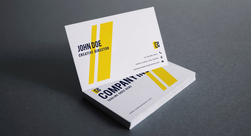
When it comes to colour, there are three types of business cards. 4+4 are double-sided business cards in full colour, 4+1 are business cards in which the front is in full colour and the back in one colour, and 4+0 is a sign which is used when we are dealing with a one-sided business card, i.e. one-coloured front and the back is white.
What business card size to choose?
In Poland, the standard size of a business card is 90 by 50 millimetres. Size 85 by 50 millimeters and 90 by 55 millimeters is also popular, but it should be remembered that these are not so popular solutions.
How to set project details?
In this case, too, it is best to refer to proven solutions, so we are dealing with CMYK colour mode, with a resolution of at least 300 dpi and a safe area of three to five millimetres on each side. This area is very important because it is assumed that it should not only the logo, but also other important information. If we care about perfect black color, we should not forget about the color component setting.
There is one more issue that may need to be clarified for a layman. We are not dealing with one, but with two shades of black, so we can count on both saturated and plain black. The difference between them is important, but you should reckon with the fact that seeing it on a computer monitor is not an easy task at all. This is not the case in the printout, which is why this issue should be given some attention.
It is also worth noting that it is recommended to devote at least two millimetres to the so-called bleeds. Of course, we are dealing with standardized value, so if a given printing house assumes otherwise, its guidelines should be considered as key. In the Illustrator we can choose the tab "Marks and Bleeds" and it will help us to choose the value we expect. We must not forget that all fonts should be converted by us into curves. Special caution is called for by those who use less common fonts. It may turn out that the printing house we have chosen simply does not have one.